Monday 8 September 2014

Can you see me yet?


Back in June (here http://lillyloray.blogspot.co.uk/2014/06/thinking-clearly-transparent-furniture.html) I wrote about the transparent trend. Well it hasn’t abated and the autumn editions of homes and interiors magazines are still showing us how to use it in our homes.
Design professionals refer to it as Lucite and it can be used in so many different ways in lighting, furniture or accessories. Just remember that a little goes a long way with the clear stuff.


Friday 5 September 2014

Get the bones right


When people talk about getting the bones of a house right they are usually referring to the correct configuration of rooms and space.  But it can also refer to the architectural detailing in a property, the cornices, architraves, paneling, doors, ironmongery etc.  Here are some rooms admittedly in period properties who have their bones in order and on show.


Wednesday 3 September 2014

A stable for the night in Hampshire


I think if I was a houseguest here I might never ever leave. This gorgeous converted stable on the grounds of a Hampshire estate once housed prized racehorses. The owners enlisted the help of Andy Ramus of AR Design Studio who helped create this modern conversion that’s kept some of the original features; such as the bays, stable doors and the troughs as basins is quite frankly genius.


Monday 1 September 2014

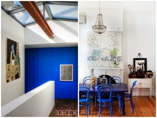
Yves Klein blue trend


Fashion quite often predicts where interiors trends may head. The Fall 2014 shows of New York showed pops of colour being used alongside the usual autumnal tones we’ve come to expect. One colour I especially loved was the pops of Yves Klein blue at Alexander Wang, Altuzarra and Proenza Schouler’s fall shows. 

It’s best paired with black and white in interiors. It makes a striking accent colour but equally works in a colour block approach. I’m sure we will see more of this colour coming through in accessories.


Friday 29 August 2014

SATURDAY DESIGNER PROFILE - French architect Joseph Dirand


The French architect Joseph Dirand has made a name for himself with Parisian institutions like Monsieur Bleu and the ChloĆ© flagship store. His clean contemporary style has hearts fluttering and temperatures rising all across the design world.

Whilst his style might be considered too minimalist for some, it is his desire to make sure that the bones of a building are beautiful and that the proportions are harmonious that has the design and architecture world watching closely. He uses luxurious materials and clean lines but doesn’t shy away from decorative finishes
and detailing.